
10 Unique Comprehensive CSS Styles for Select Inputs in 2024
Table of Contents
Customizing <select> inputs with unique styles and arrow designs can significantly elevate the user interface of your web forms. This guide presents 10 different styles, each with a distinct appearance and custom arrow, accompanied by full HTML/CSS code.
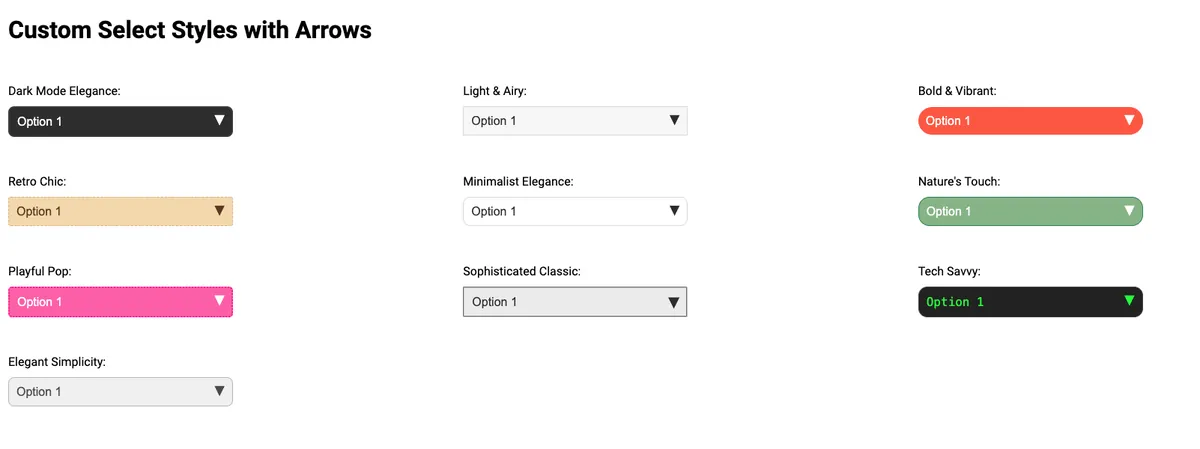
1. Dark Mode Elegance Select
Description: Ideal for dark-themed interfaces, featuring a sleek downward arrow for a sophisticated look.
HTML:
<!-- Dark Mode Elegance Select Input -->
<div class="custom-select-container">
    <label for="dark-mode-elegance">Dark Mode Elegance:</label>
    <div class="custom-select dark-mode-elegance">
        <select id="dark-mode-elegance">
            <option>Option 1</option>
            <option>Option 2</option>
            <option>Option 3</option>
        </select>
    </div>
</div>
CSS:
/* Dark Mode Elegance Styles */
.custom-select.dark-mode-elegance {
    position: relative;
    background-color: #333;
    border-radius: 5px;
}

.custom-select.dark-mode-elegance select {
    width: 100%;
    padding: 10px;
    color: #fff;
    border: none;
    -webkit-appearance: none;
    -moz-appearance: none;
    appearance: none;
}

.custom-select.dark-mode-elegance::after {
    content: '▼';
    color: white;
    position: absolute;
    right: 10px;
    top: 50%;
    transform: translateY(-50%);
    pointer-events: none;
}
2. Light & Airy
Description: A fresh, light-themed design with a delicate arrow, perfect for minimalist layouts.
HTML:
<!-- Light & Airy Select Input -->
<div class="custom-select-container">
    <label for="light-airy">Light & Airy:</label>
    <div class="custom-select light-airy">
        <select id="light-airy">
            <option>Option 1</option>
            <option>Option 2</option>
            <option>Option 3</option>
        </select>
    </div>
</div>
CSS:
/* Light & Airy Styles */
.custom-select.light-airy {
    position: relative;
    background-color: #f8f8f8;
    border-radius: 5px;
}

.custom-select.light-airy select {
    width: 100%;
    padding: 10px;
    color: #333;
    border: 1px solid #ddd;
    -webkit-appearance: none;
    -moz-appearance: none;
    appearance: none;
}

.custom-select.light-airy::after {
    content: '▼';
    color: #333;
    position: absolute;
    right: 10px;
    top: 50%;
    transform: translateY(-50%);
    pointer-events: none;
}
3. Bold & Vibrant
Description: A striking design with bold colors and a standout arrow, suited for dynamic interfaces.
HTML:
<!-- Bold & Vibrant Select Input -->
<div class="custom-select-container">
    <label for="bold-vibrant">Bold & Vibrant:</label>
    <div class="custom-select bold-vibrant">
        <select id="bold-vibrant">
            <option>Option 1</option>
            <option>Option 2</option>
            <option>Option 3</option>
        </select>
    </div>
</div>
CSS:
/* Bold & Vibrant Styles */
.custom-select.bold-vibrant {
    position: relative;
    background-color: #ff6347;
    border-radius: 5px;
}

.custom-select.bold-vibrant select {
    width: 100%;
    padding: 10px;
    color: white;
    border: none;
    -webkit-appearance: none;
    -moz-appearance: none;
    appearance: none;
}

.custom-select.bold-vibrant::after {
    content: '▼';
    color: white;
    position: absolute;
    right: 10px;
    top: 50%;
    transform: translateY(-50%);
    pointer-events: none;
}
4. Elegant Minimalist
Description: A sleek, minimalist design with a subtle arrow, perfect for modern interfaces.
HTML:
<!-- Elegant Minimalist Select Input -->
<div class="custom-arrow elegant-minimalist">
    <label for="elegant-minimalist">Elegant Minimalist:</label>
    <select id="elegant-minimalist">
        <option>Option 1</option>
        <option>Option 2</option>
        <option>Option 3</option>
    </select>
</div>
CSS:
.custom-arrow.elegant-minimalist {
    position: relative;
    background-color: #fff;
    border: 2px solid #000;
}
.custom-arrow.elegant-minimalist select {
    color: #000;
    padding-right: 30px;
    -webkit-appearance: none;
    -moz-appearance: none;
    appearance: none;
}
.custom-arrow.elegant-minimalist::after {
    content: '▼';
    color: #000;
    position: absolute;
    right: 10px;
    top: 50%;
    transform: translateY(-50%);
    pointer-events: none;
}
5. Nature Lover
Description: Inspired by nature, this style uses earth tones and a leaf-shaped arrow.
HTML:
<!-- Nature Lover Select Input -->
<div class="custom-arrow nature-lover">
    <label for="nature-lover">Nature Lover:</label>
    <select id="nature-lover">
        <option>Option 1</option>
        <option>Option 2</option>
        <option>Option 3</option>
    </select>
</div>
CSS:
.custom-arrow.nature-lover {
    position: relative;
    background-color: #8fbc8f; /* Dark Sea Green */
    border: 1px solid #2e8b57; /* Sea Green */
}
.custom-arrow.nature-lover select {
    color: #2e8b57;
    padding-right: 30px;
    -webkit-appearance: none;
    -moz-appearance: none;
    appearance: none;
}
.custom-arrow.nature-lover::after {
    content: '????'; /* Leaf emoji as arrow */
    position: absolute;
    right: 10px;
    top: 50%;
    transform: translateY(-50%);
    font-size: 12px;
    pointer-events: none;
}
6. Neon Glow
Description: A vibrant, neon-themed select input with a contrasting arrow.
HTML:
<!-- Neon Glow Select Input -->
<div class="custom-arrow neon-glow">
    <label for="neon-glow">Neon Glow:</label>
    <select id="neon-glow">
        <option>Option 1</option>
        <option>Option 2</option>
        <option>Option 3</option>
    </select>
</div>
CSS:
.custom-arrow.neon-glow {
    position: relative;
    background-color: #000;
    border: 1px solid #39ff14; /* Neon green */
}
.custom-arrow.neon-glow select {
    color: #39ff14; /* Neon green */
    padding-right: 30px;
    -webkit-appearance: none;
    -moz-appearance: none;
    appearance: none;
}
.custom-arrow.neon-glow::after {
    content: '▼';
    color: #39ff14; /* Neon green */
    position: absolute;
    right: 10px;
    top: 50%;
    transform: translateY(-50%);
    pointer-events: none;
}
7. Ocean Breeze
Description: Reflecting the calmness of the ocean, this style features a wave-shaped arrow.
HTML:
<!-- Ocean Breeze Select Input -->
<div class="custom-arrow ocean-breeze">
    <label for="ocean-breeze">Ocean Breeze:</label>
    <select id="ocean-breeze">
        <option>Option 1</option>
        <option>Option 2</option>
        <option>Option 3</option>
    </select>
</div>
CSS:
.custom-arrow.ocean-breeze {
    position: relative;
    background-color: #00bfff; /* Deep Sky Blue */
    border: 1px solid #0000cd; /* Medium Blue */
}
.custom-arrow.ocean-breeze select {
    color: #0000cd; /* Medium Blue */
    padding-right: 30px;
    -webkit-appearance: none;
    -moz-appearance: none;
    appearance: none;
}
.custom-arrow.ocean-breeze::after {
    content: '????'; /* Wave emoji as arrow */
    position: absolute;
    right: 10px;
    top: 50%;
    transform: translateY(-50%);
    font-size: 12px;
    pointer-events: none;
}
8. Tech Savvy
Description: A high-tech themed design with a digital arrow, perfect for tech-oriented sites.
HTML:
<!-- Tech Savvy Select Input -->
<div class="custom-arrow tech-savvy">
    <label for="tech-savvy">Tech Savvy:</label>
    <select id="tech-savvy">
        <option>Option 1</option>
        <option>Option 2</option>
        <option>Option 3</option>
    </select>
</div>
CSS:
.custom-arrow.tech-savvy {
    position: relative;
    background-color: #2c3e50; /* Asbestos color */
    border: 1px solid #7f8c8d; /* Concrete color */
}
.custom-arrow.tech-savvy select {
    color: #7f8c8d; /* Concrete color */
    padding-right: 30px;
    -webkit-appearance: none;
    -moz-appearance: none;
    appearance: none;
}
.custom-arrow.tech-savvy::after {
    content: '⬇️'; /* Downward arrow emoji */
    position: absolute;
    right: 10px;
    top: 50%;
    transform: translateY(-50%);
    pointer-events: none;
}
9. Playful Pop
Description: A fun and playful style with a colorful arrow, great for informal or creative websites.
HTML:
<!-- Playful Pop Select Input -->
<div class="custom-arrow playful-pop">
    <label for="playful-pop">Playful Pop:</label>
    <select id="playful-pop">
        <option>Option 1</option>
        <option>Option 2</option>
        <option>Option 3</option>
    </select>
</div>
CSS:
<!-- Elegant Simplicity Select Input -->
<div class="custom-arrow elegant-simplicity">
    <label for="elegant-simplicity">Elegant Simplicity:</label>
    <select id="elegant-simplicity">
        <option>Option 1</option>
        <option>Option 2</option>
        <option>Option 3</option>
    </select>
</div>
10. Elegant Simplicity
Description: A refined and simple design with a subtle arrow, ideal for elegant and upscale websites.
HTML:
<!-- Elegant Simplicity Select Input -->
<div class="custom-arrow elegant-simplicity">
    <label for="elegant-simplicity">Elegant Simplicity:</label>
    <select id="elegant-simplicity">
        <option>Option 1</option>
        <option>Option 2</option>
        <option>Option 3</option>
    </select>
</div>
CSS:
.custom-arrow.elegant-simplicity {
    position: relative;
    background-color: #f2f2f2;
    border: 1px solid #bfbfbf;
}
.custom-arrow.elegant-simplicity select {
    color: #555;
    padding-right: 30px;
    -webkit-appearance: none;
    -moz-appearance: none;
    appearance: none;
}
.custom-arrow.elegant-simplicity::after {
    content: '▼';
    color: #555;
    position: absolute;
    right: 10px;
    top: 50%;
    transform: translateY(-50%);
    pointer-events: none;
}
Common Arrow Code (for all above) For Select Inputs:
.custom-arrow select {
  width: 100%;
  padding: 10px;
  -webkit-appearance: none;
  -moz-appearance: none;
  appearance: none;
  border-radius: 4px;
  font-size: 16px;
}
.custom-arrow::after {
  content: "▼";
  position: absolute;
  right: 10px;
  top: 50%;
  /*             transform: translateY(-50%); */
  pointer-events: none;
}
These 10 unique select input styles with custom arrows offer a wide range of design possibilities, each tailored to fit different themes and aesthetics of websites. Experiment with these examples to find the perfect match for your site’s design.
Learn more about select input and its attributes here: https://developer.mozilla.org/en-US/docs/Web/HTML/Element/select